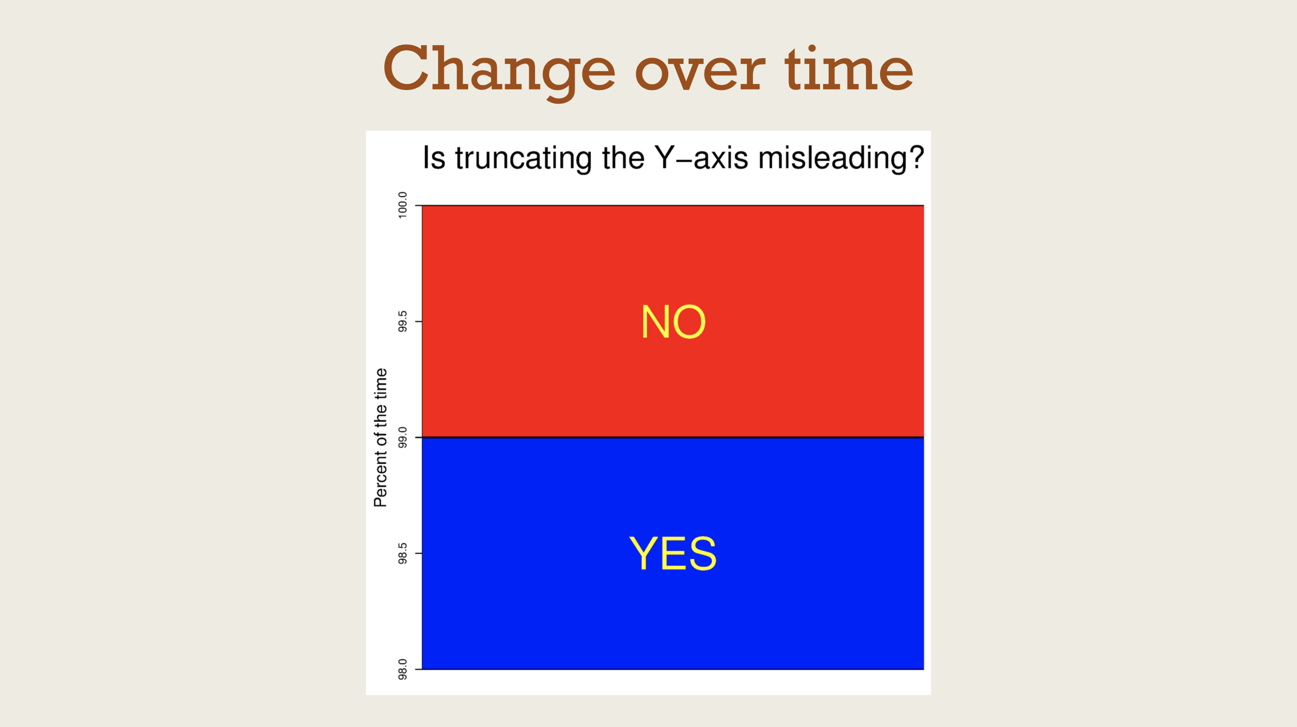
Change over time
Materials for class on Tuesday, October 10, 2017
Contents
Slides
Download the slides from today’s lecture.
Make this plot
Data
See complete column descriptions. The data is released under a public domain license and hosted originally at Kaggle.
Louisville animal bites
Colors
- Colors originally from this palette at Adobe Color.
#F05A2A - #2FCBC5
- #37291E
Fonts
- Download Roboto Condensed from Google Fonts.
Roboto Condensed Bold in the title - Roboto Condensed Light in subtitle and caption
- Roboto Condensed everywhere else
Final figure
library(tidyverse)
library(lubridate)

bites_raw <- read_csv("data/Health_AnimalBites.csv")

bites <- bites_raw %>%
  mutate(year = year(bite_date)) %>%
  mutate(species = recode(SpeciesIDDesc,
                          CAT = "Cat", DOG = "Dog", .default = "Other")) %>%
  mutate(species = factor(species, levels = c("Dog", "Cat", "Other"), ordered = TRUE)) %>%
  filter(year < 2018, year > 2010)

bites_plot_year <- bites %>%
  filter(!is.na(species)) %>%
  group_by(year, species) %>%
  summarize(total_bites = n())

fancy_theme <- function(base_size = 11) {
  theme_minimal(base_family = "Roboto Condensed", base_size = base_size) +
  theme(plot.title = element_text(family = "Roboto Condensed", face = "bold",
                                  size = rel(1.5)),
        plot.caption = element_text(family = "Roboto Condensed Light", face = "plain",
                                    size = rel(0.7)),
        plot.subtitle = element_text(family = "Roboto Condensed Light", face = "plain",
                                     size = rel(1.1)),
        legend.position = "bottom",
        panel.grid.minor = element_blank())
}

nice_plot <- ggplot(bites_plot_year, aes(x = year, y = total_bites, color = species, group = species)) +
  geom_line(size = 2) +
  labs(x = NULL, y = "Total number of bites",
       title = "Is the Louisville canine rampage over?",
       subtitle = "Total number of reported animal bites per year",
       caption = "Source: Louisville Metro Department of Public Health and Wellness") +
  guides(color = guide_legend(title = NULL)) +
  scale_color_manual(values = c("#F05A2A", "#2FCBC5", "#37291E")) +
  scale_x_continuous(breaks = seq(2011, 2017, 1)) +
  fancy_theme(base_size = 18)

nice_plot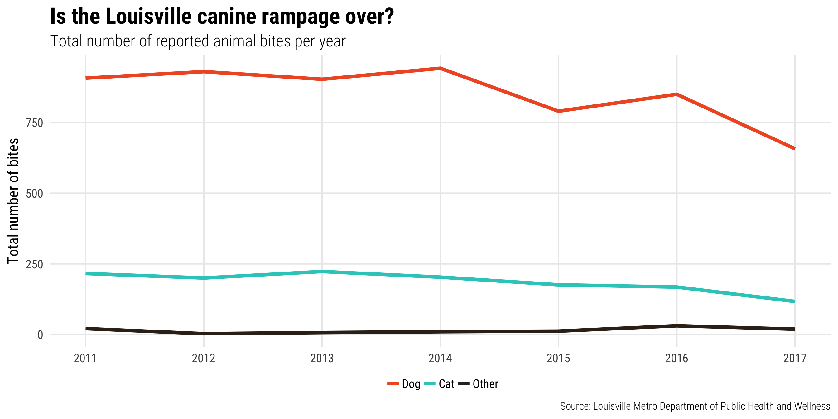
ggsave(nice_plot + fancy_theme(base_size = 11),
       filename = "output/nice_plot.pdf", device = cairo_pdf,
       width = 7, height = 4, dpi = 300)
ggsave(nice_plot + fancy_theme(base_size = 11),
       filename = "output/nice_plot.png", type = "cairo",
       width = 7, height = 4, dpi = 300)
Refining and enhancing plots in Illustrator
Install a vector image editor
- Adobe Illustrator: This is the industry standard vector editor; it’s expensive, but it’s free for BYU students.
- Inkscape: This is an open source editor, so it’s free (yay!) but can be clunky to work with (boo). It’s sufficient for what we’re going to be doing, though.
- Important for Mac users: you have to install XQuartz before installing Inkscape, which is fine because you also need it for embedding custom fonts in R anyway
- Also, the developers haven’t paid for a macOS developer certificate, so Inkscape might show an error saying it can’t open the first time you try to open it. If that happens, go find it in your “Applications” folder, right click on Inkscape, and choose “Open”. You only have to do this one time—after you’ve opened it like this once, it will open just fine in the future.
Make an image and refine it
Data: Nathan’s Famous Hot Dog contest winners Data originally from FlowingData.
Plot with transparent background:
library(tidyverse)

hotdogs <- read_csv("data/hot-dog-contest-winners.csv") %>%
  rename(dogs = `Dogs eaten`, record = `New record`) %>%
  mutate(record = factor(record))

plot_hotdogs <- ggplot(hotdogs, aes(x = Year, y = dogs, fill = record)) +
  geom_col() +
  scale_fill_manual(values = c("grey80", "#FC7300")) +
  scale_x_continuous(breaks = seq(1980, 2010, 2), expand = c(0, 0)) +
  scale_y_continuous(breaks = seq(0, 70, 10), expand = c(0, 0)) +
  guides(fill = FALSE) +
  labs(y = "Hot dogs and buns", x = NULL) +
  theme_minimal() +
  theme(panel.background = element_rect(fill = "transparent", colour = NA),
        plot.background = element_rect(fill = "transparent", colour = NA),
        axis.ticks.x = element_line(size = 0.25),
        panel.grid.major.x = element_blank(),
        panel.grid.major.y = element_line(size = 0.5, linetype = "dashed"),
        panel.grid.minor = element_blank())

plot_hotdogs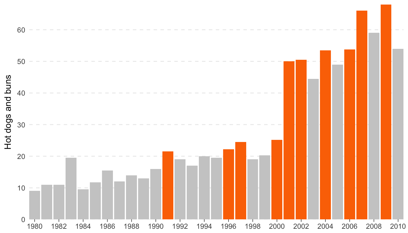
ggsave(plot_hotdogs, filename = "output/hotdogs.pdf", device = cairo_pdf,
       width = 7, height = 4, units = "in", bg = "transparent")
Text for annotations:
- Winners from Nathan’s Hot Dog Eating Contest
- It’s that time of year again. Since 1916, the annual eating competition has grown substantially attracting competitors from around the world
- Frank Dellarosa eats 21 and a half HDBs over 12 minutes, breaking the previous record of 19 and a half
- Through 2001-2005, Takeru Kobayashi wins by no less than 12 HDBs. In 2006 he only wins by 1.75. After winning 6 years in a row and setting the world record 4 times, Kobayashi places second in 2007.
- For the first time since 1999, an American reclaims the title when Joey Chestnut consumes 66 HDBs, a new world record. Chestnut repeats in 2008.
- Source: Wikipedia and Nathan’s Famous
Enhanced plot:
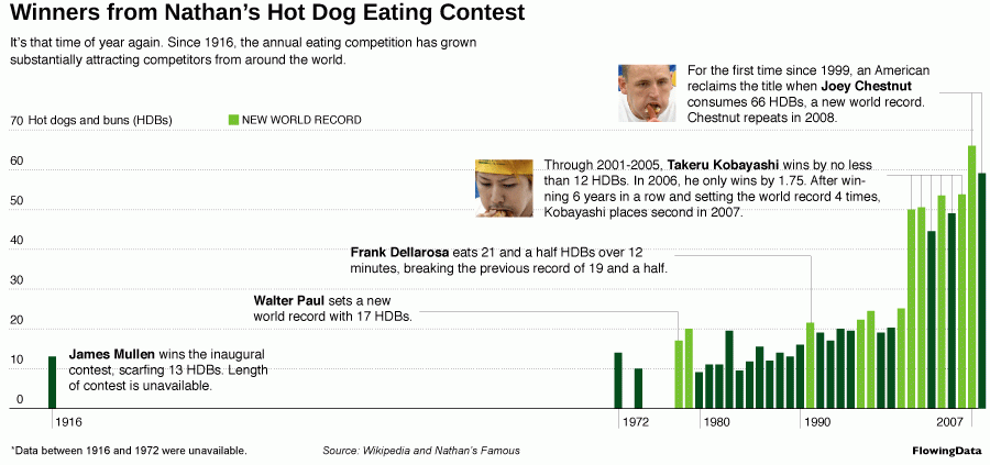
Enhanced hot dog eating contest graph
Bonus ggplot features
Extensions
So far, we’ve used a few extra packages to enhance our ggplot plots, like ggrepel, gridExtra, and ggThemeAssist. There are dozens of other ggplot-related packages, but it’s hard to find them or know what exists. The ggplot2 Extensions Gallery helpfully lists 35As of October 9, 2017
different packages.
Animation
You can use the gganimate package to add a new aesthetic “frame” to your plots, meaning you can map a variable like “year” to a plot to show changes over time.
Install the package in R with this command: (it’s not on CRAN so you can’t use the “Packages” panel):
# install.packages(devtools)  # Install devtools it it's not already installed
devtools::install_github("dgrtwo/gganimate")
Before you use it, though, you have to install two command line tools on your computer to manipulate images and videos. You don’t actually have to ever use these programs—they just have to be installed, and gganimate will use them.
- ImageMagick: tool for creating and manipulationg animated GIFs and other images
- FFmpeg: tool for creating and manipulating movie files
Installation on Windows
- Download ImageMagick for Windows and run the installer.
- Make sure you select these options:
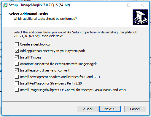
- Add application directory to your system path
- Install FFmpeg (this will save you from having to install FFMpeg separately)
- Install legacy utilities
- Restart your computer (or at least log out and log back in)
Installation on macOS
Because both ImageMagick and FFmpeg are Linux-based programs, and because underneath its fancy bells and whistles, macOS is essentially a Unix system, there’s no automatic installer for macOS. You have to install ImageMagick and FFmpeg with Terminal instead, but it’s not hard!
- Open Terminal
- Go to brew.sh, copy the big long command under “Install Homebrew” (starts with
/usr/bin/ruby -e "$(curl -fsSL...), paste it into Terminal, and press enter. This installs Homebrew, which is special software that lets you install Unix-y programs from the terminal. You can install stuff like MySQL, Python, Apache, and even R if you want; there’s a full list of Homebrew formulae here.
Type these three lines in Terminal:
brew install imagemagick brew install libvpx brew install ffmpeg --with-libvpx- Wait for a few minutes while your Terminal makes you feel like a hacker.
The end. You shouldn’t have to restart or log out.
Usage
We won’t cover this in very much depth in class—look at the documentation at GitHub for full details. Here’s a quick example, though. Note the new frame = year aesthetic mapping:
library(tidyverse)
library(gapminder)
library(gganimate)
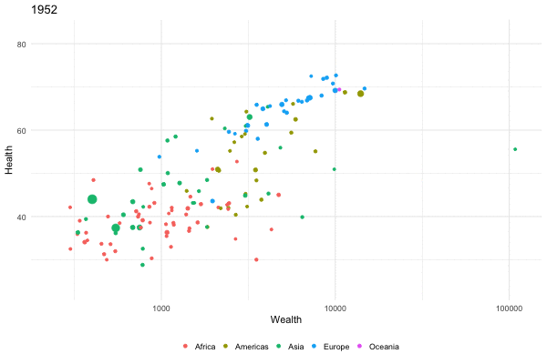
rosling_plot <- ggplot(gapminder,
aes(gdpPercap, lifeExp, size = pop,
color = continent, frame = year)) +
geom_point() +
scale_x_log10() +
guides(size = FALSE, color = guide_legend(title = NULL)) +
labs(x = "Wealth", y = "Health") +
theme_minimal() +
theme(legend.position = "bottom")
Animated Gapminder plot
You can also save the animation to your computer:
gganimate(rosling_plot, filename = "name_of_file.gif",
          ani.width = 600, ani.height = 400)
gganimate(rosling_plot, filename = "name_of_file.mp4",
          ani.width = 600, ani.height = 400)
You can adjust the animation speed with the interval argument in gganimate():
Fast animated Gapminder plot
To use this in an R Markdown document, you have to include fig.show="animate" in the chunk options, otherwise each individual frame will be shown. If you’re using a custom interval, you have to specify it with interval=X. You can also specify the output format for the HTML chunk (e.g. gif, webm, mp4, etc.):
{r name-of-chunk, fig.show="animate", interval=0.2, ffmpeg.format="gif", warning=FALSE, message=FALSE}These animations tend to not be very smooth, though, with data points jumping to their new positions every five years (in the case of the Gapminder data). We can make everything go a lot smoother with the tweenr package, which interpolates data points to smooth everything out. You have to transform the data little first, but the end result is magical:This code is from David Smith.
# install.packages('tweenr')  # Install if necessary; it's on CRAN
library(tweenr)

gapminder_edit <- gapminder %>%
  arrange(country, year) %>%
  select(x = gdpPercap, y = lifeExp, time = year, id = country, continent, pop) %>%
  mutate(ease="linear")

gapminder_tween <- tween_elements(gapminder_edit,
                                  "time", "id", "ease", nframes = 300) %>%
  mutate(year = round(time), country = .group) %>%
  left_join(gapminder, by=c("country", "year", "continent")) %>%
  rename(pop = pop.x)

rosling_plot_tween <- ggplot(gapminder_tween,
                             aes(x = x, y = y, size = pop,
                                 color = continent, frame = .frame)) +
  geom_point() +
  scale_x_log10() +
  guides(size = FALSE, color = guide_legend(title = NULL)) +
  labs(x = "Wealth", y = "Health") +
  theme_minimal() +
  theme(legend.position = "bottom")

gganimate(rosling_plot_tween, filename = "rosling_plot_tween.mp4",
          ani.width=600, ani.height=400, title_frame = FALSE, interval = 0.05)
Feedback for today
Go to this form and answer these three questions (anonymously if you want):
- What new thing did you learn today?
- What was the most unclear thing about today?
- What was the most exciting thing you learned today?