Final project
Due by 11:59 PM on Wednesday, October 25, 2017

You made it to the end of our whirlwind tour of data visualization principles! Congratulations!
Now you get to show off all the tools you learned with (1) your final rubric and (2) a beautiful, truthful, narrative visualization.
Rubric
You’ve received feedback from me and your peers and you’ve tested out your rubric on two existing graphics. Polish up your data visualization rubric and e-mail me the final version. Half of your final project grade will be based on this, so make sure the rubric yields actual numbers.I sadly have no idea what “strong” + “acceptable” + “weak” is in real numbers.
You’ll also want to make sure it has good external validity and works well when other people use it.
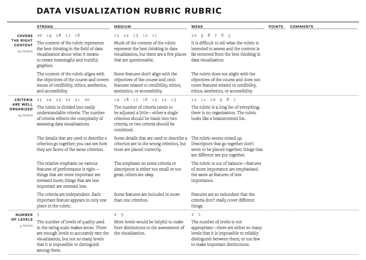
I will grade your rubric with this rubric.
Visualization
For your final project, you will take a dataset, explore it, tinker with it, and tell a nuanced story about it using at least three graphs.
I want this project to be as useful for you and your future career as possible—you’ll hopefully want to show off your final project in a portfolio or during job interviews.
Accordingly, you have some choice in what data you can use for this project. I’ve found several different high-quality datasets online related to the core MPA tracks (and some business stuff too, for the MBAs in the class).
You do not have to choose a dataset in your given emphasis. Choose whatever one you are most interested in or will have the most fun with.
Nonprofit management
- U.S. Charities and Non-profits: All of the charities and nonprofits registered with the IRSSource: IRS. This is actually split into six separate files. You can combine them all into one massive national database with
bind_rows(), or filter the data to include specific states (or a single state). It all depends on the story you’re telling.
- Nonprofit Grants 2010 to 2016: Nonprofit grants made in the US as listed in Schedule I of the IRS 990 tax form between 2010 to 2016Source: IRS
Federal, state, and local government management
- Deadly traffic accidents in the UK (2015): List of all traffic-related deaths in the UK in 2015Source: data.gov.uk
- Firefighter Fatalities in the United States: Name, rank, and cause of death for all firefighters killed since 2000Source: FEMA
- Federal Emergencies and Disasters, 1953–Present: Every federal emergency or disaster declared by the President of the United States since 1953Source: FEMA
- Global Terrorism Database (1970–2016): 170,000 terrorist attacks worldwide, 1970-2016Source: National Consortium for the Study of Terrorism and Responses to Terrorism (START), University of Maryland
- City of Austin 311 Unified Data: All 311 calls to the City of Austin since 2014Source: City of Austin
Business management
- 515K Hotel Reviews Data in Europe: 515,000 customer reviews and scoring of 1,493 luxury hotels across EuropeSource: Booking.com
- Chase Bank Branch Deposits, 2010–2016: Records for every branch of Chase Bank in the United StatesSource: Chase Bank. This dataset is not quite tidy and will require a little bit of reshaping with
gather(), since there are individual columns of deposits per year.
Instructions
Here’s what you’ll need to do:
- Download a dataset and explore it. Many of these datasets are large and will not open (well) in Excel, so you’ll need to load the CSV file into R with
read_csv(). Most of these datasets have nice categorical variables that you can use for grouping and summarizing, and many have time components too, so you can look at trends. Your past homework assignments will come in handy here. - Find a story in the data. Explore that story and make sure it’s true and insightful.
- Use R to create multiple graphs to tell the story. You can make as many graphs as you want, but you must use at least three different chart types (i.e. don’t just make three scatterplots).
- Export these figures as PDF files, place them in Inkscape or Adobe Illustrator (or InDesign), and make one combined graphic or handout where you tell the complete story. You have a lot of latitude in how you do this. You can make a graphic-heavy one-page handout. You can make something along the lines of the Nuclear Slowdown figure, with one big graphic + smaller subgraphics + explanatory text. Just don’t make a goofy infographic. Whatever you do, the final figure must include all the graphics, must have some explanatory text to help summarize the narrative, and must be well designed.
- Export the final graphic from Inkscape or Illustrator as a PDF and a PNG.
- Write a memo using R Markdown to introduce, frame, and describe your story and figure. Use this template to get started. You should include the following in the memo:
- Executive summary
- Background information and summary of the data
- Explanation, description, and code for each individual figure
- Explanation and description for the final figure
- Final figure should be included as an image (remember
)
Remember to follow R Markdown etiquette rules and style—don’t have it output extraneous messages or warnings, include summary tables in nice tables (remember knitr::kable()), adjust the dimensions for your figures, and remove the placeholder text that’s in the template already (i.e. I don’t wan’t to see stuff like “Describe and show how you cleaned and reshaped the data” in the final report.)
You can download a full example of what a final project might look like (but don’t make your final combined visualization look exactly like this—show some creativity!)
Final deliverables
You must e-mail me the following files before the deadline. 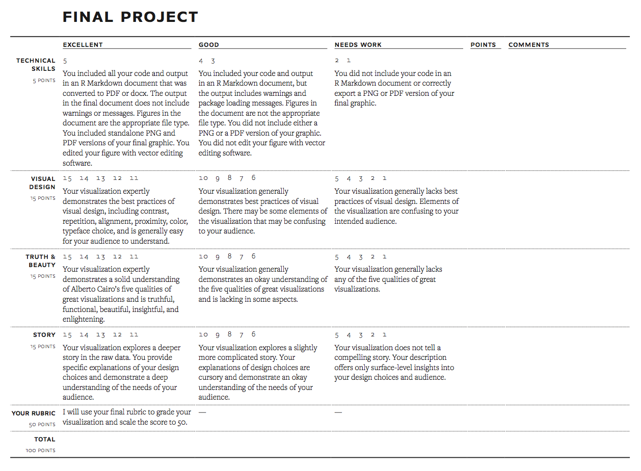
- A memo introducing and describing your final graphic (see full instructions above)
- A standalone PDF of your graphic exported from Inkscape or Illustrator
- A standalone PNG of your graphic exported from Inkscape or Illustrator
- A PDF of your final rubric for evaluating visualizations
No late work will be accepted for this project since it’s the last project and it counts as your final.
I will use this rubric to grade the final product.

I am happy to give feedback and help along the way—just not at, like, 10 PM on the night it’s due. Please don’t hesitate to come and get help! My goal is for you to have a beautiful graphic in the end that you’ll want to show off to all your friends, family, neighbors, employers, and strangers on the street—I’m not trying to trip you up or give you trick questions!
And that’s it. You’re done! Go out into the world now and make beautiful, insightul, and truthful graphics.