Rubric test run
Due by 11:59 PM on Monday, October 9, 2017
Before you turn in your final rubric, you’ll need to make sure it actually works. Use your improved and commented-upon draft rubric to evaluate the two visualizations below.
You’ll only be graded for completion, but you’ll want to do a thorough job to make sure your rubric works and matches expectations. You might also want to have a friend grade the same visualizations with your rubric to see if the scores are consistent across graders (especially since I’ll be using your rubric on your final project).
Email me a PDF of your filled-in rubric for each visualization, along with a short paragraph describing how well it worked/didn’t work and what changes you made/didn’t make.
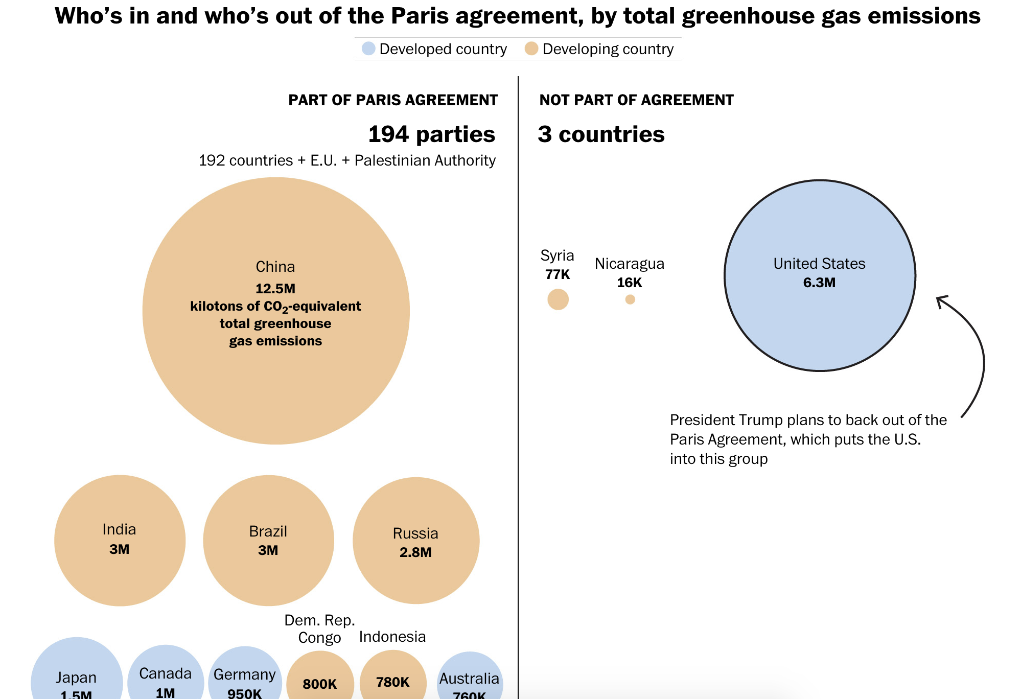
Visualization 1
You need to view the full graphic at the Washington Post’s website—don’t grade the visualization based on the screenshot below.
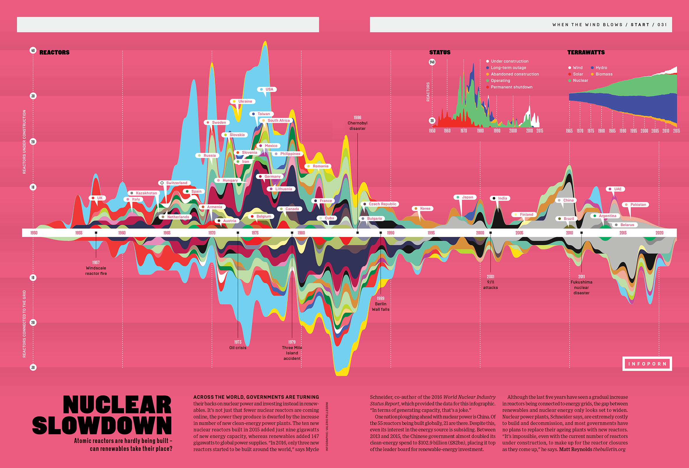
Visualization 2
Valerio Pellegrini, “Nuclear Slowdown,” Wired UK
You need to view the full graphic at Wired, Bēhance, or by clicking on the screenshot—don’t grade the visualization based on the smaller image below.