Change over time
Due by 11:59 PM on Monday, October 9, 2017
Complete these tasks in an R Markdown file and e-mail me a PDF of the final compiled document. Here’s the typical starter file.Your browser will most likely open it as a new tab instead of downloading the file. Either right click on the link and choose “Save link as…” or copy and paste the text into a blank R Markdown file in RStudio.
I recommend saving it within an RStudio project.

In the past, I haven’t cared so much about the output of the Rmd files, and it’s been fine to have them full of warnings and errors and huge graphics. This week (and in the future too), you’ll need to make sure your homework memos are more polished. Remove messages and warnings from chunks that output them (hi super verbose library(tidyverse)), make sure your figures are appropriately sized, etc. Ideally, you’ll have a clear, clutter-free memo describing each step you take and showing clean code and output.
You’ll notice that the starter file is mostly empty. You’re on your own now.
Task 1: Reflection memo
Write a 500-wordBack to normal again.
memo about the assigned readings for this week. You can use some of the prompt questions there if you want:
- When is it okay (or not) to truncate the y-axis?
- It is remarkably easy to mislead people with many of these chart types. Why? How can you avoid the same mistakes?
- All these types of charts are good at communicating change over time, but some are more appropriate in different situations. When is it best to use these different types (e.g. line graphs vs. area graphs vs. horizon charts vs. heatmaps, etc.)?
As you write the memo, also consider these central questions:
- How do these readings connect to our main goal of discovering truth?
- How does what I just read apply to me?
- How can this be useful to me?
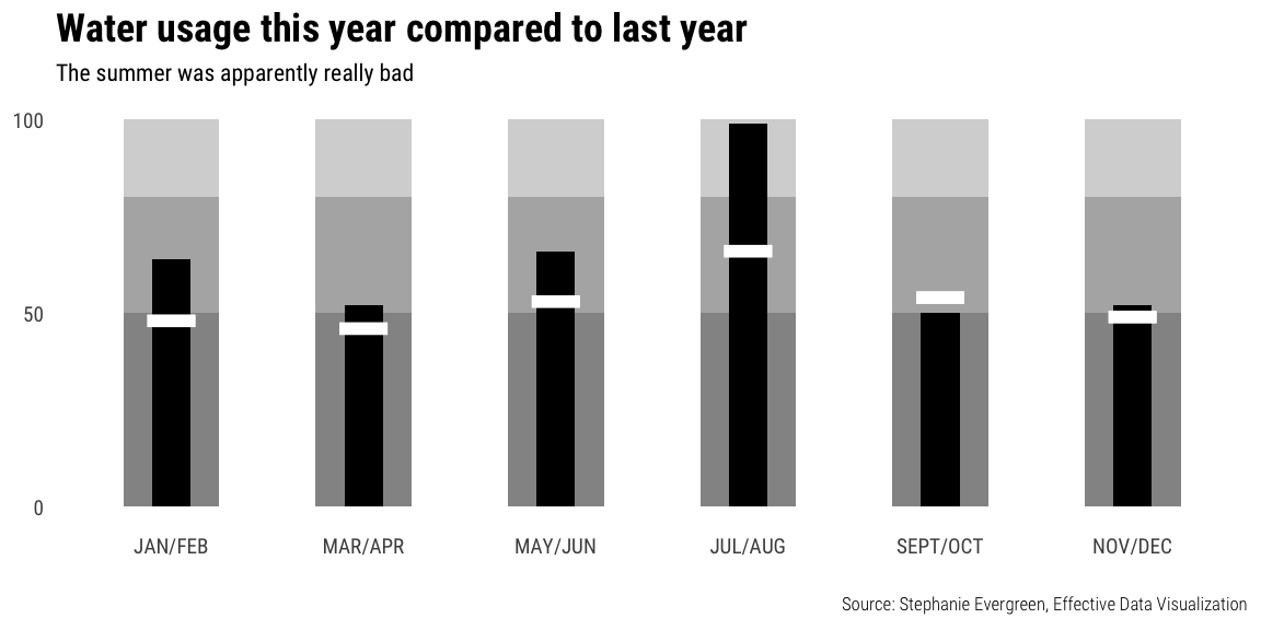
Task 2: Bullet charts
Recreate this figure in R. Original figure by Bill Dean, posted at “The Bullet Graph”.
Don’t worry about including the legend.
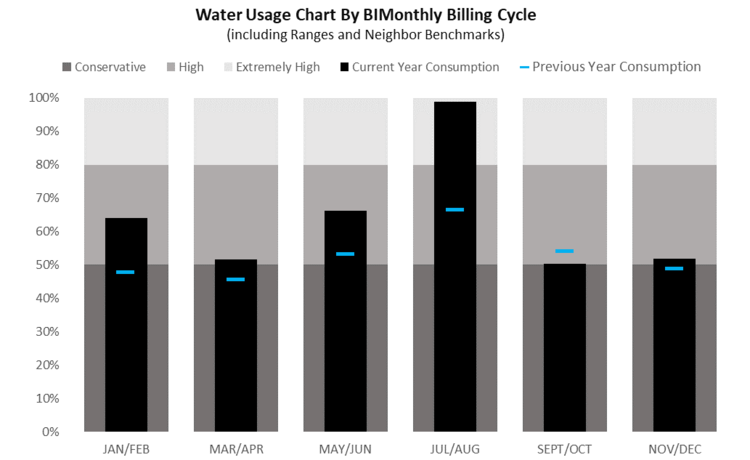
Bill Dean’s bullet chart
Use this data: water_usage.csv
A couple hints:
- You can see general code for bullet charts in R here
- You’ll need to make the months an ordered factor, otherwise they’ll plot alphabetically. Use
fct_inorder(variable_name_here, ordered = TRUE)from theforcatslibrary
The final image should look something like this: Don’t worry about custom fonts unless you want to be brave; I’m using Roboto Condensed in the plot.
You can use whatever colors you want.
Task 3: Internet use around the world
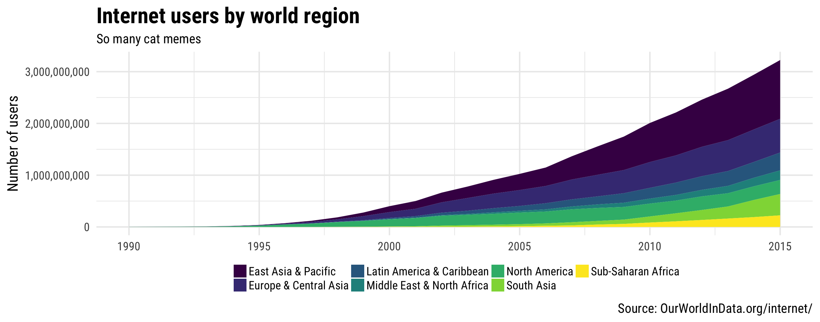
Task 3a: Total internet users by region
Plot the total number of internet users around the world by region using an area chart (hint, try geom_area()). Basically, make something similar to the figure below. But don’t worry about custom fonts unless you want to be brave; I’m using Roboto Condensed in the plot.
You can use whatever colors you want.
This data comes from Max Roser’s Our World in Data project.
Use this data: internet-users-by-world-region.csv
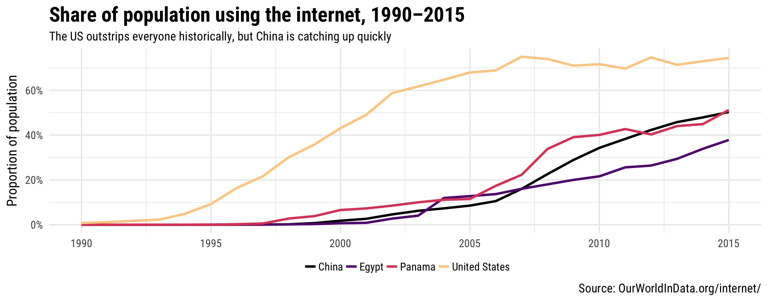
Task 3b: Proportion of internet users in specific countries
Plot the proportion of population using the internet in a few countries using a line chart. The data you download includes values for hundreds of countries, so you’ll need to filter it (hint, use something like filter(Entity %in% c("list", "of", "countries", "here") when you create/load the data you’re plotting). Basically, make something similar to the figure below. Once again, don’t worry about custom fonts unless you want to be brave; I’m using Roboto Condensed in the plot.
You can use whatever colors you want.
This data also comes from Max Roser’s Our World in Data project.
Use this data: share-of-individuals-using-the-internet-1990-2015.csv