Redesign 3: Refugees in the United States
Due by 11:59 PM on Monday, October 16, 2017
The United States has resettled more than 600,000 refugees from 60 different countries since 2006.

In this final redesign assignment, you will use R, ggplot, and Illustrator or Inkscape to explore where these refugees have come from.
You can redesign one of these ugly, less-than-helpful graphs, or create a new story.
Here’s what you need to do:
- Download the Department of Homeland Security’s annual count of people granted refugee status between 2006–2015.As always, you’ll probably need to right click on this link and choose “Save link as…”, since your browser might want to display it as text. The data was originally uploaded by the Department of Homeland Security to Kaggle, and is provided with a public domain license.
- Clean the data using the code I’ve given you below.
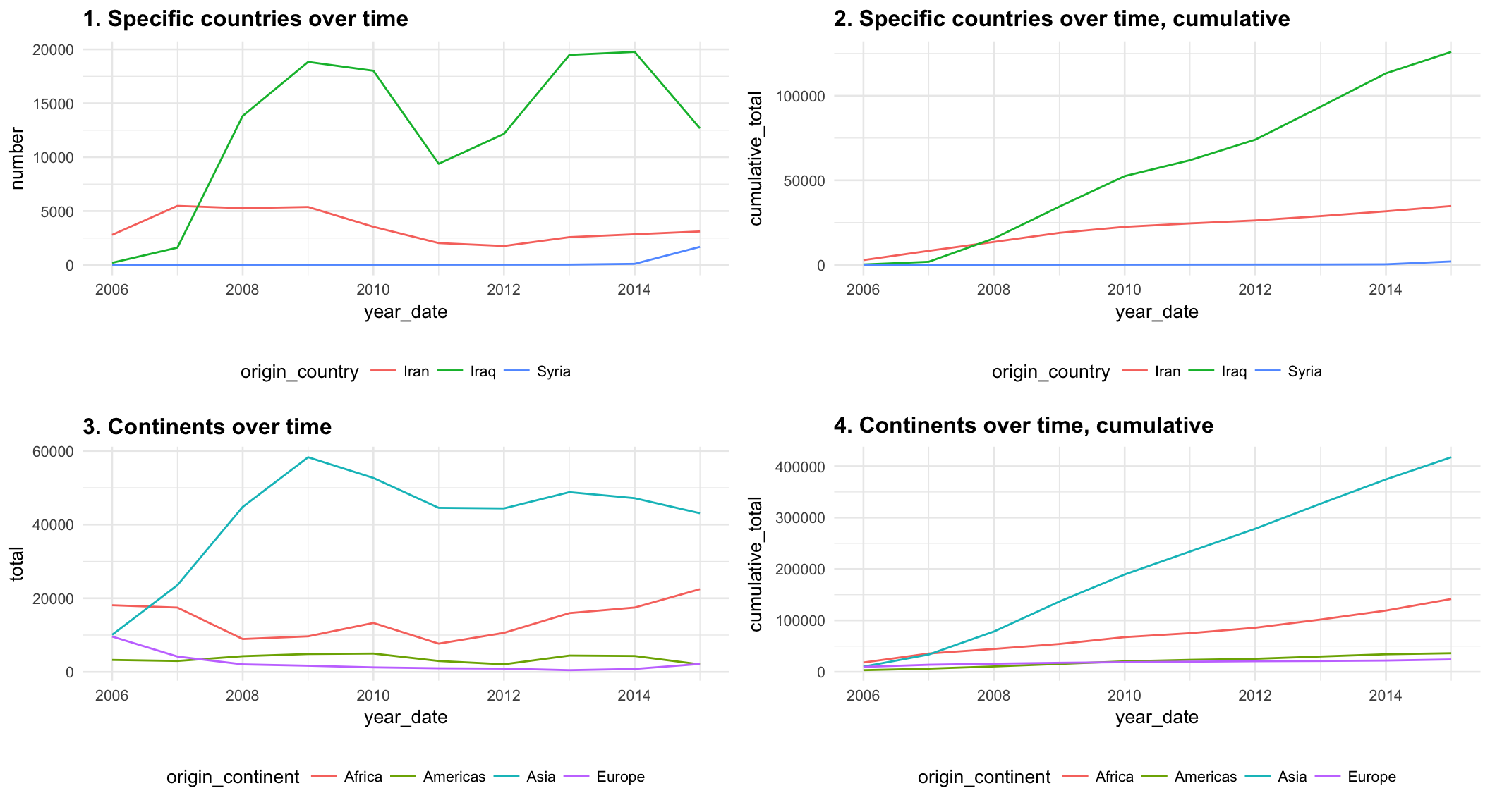
- Create an appropriate time-based visualization based on the data. I’ve shown a few different ways to summarize the data so that it’s plottable down below. Don’t just calculate overall averages or totals per country—the visualization needs to deal with change over time. Do as much polishing and refining in R—make adjustments to the colors, scales, labels, grid lines, and even fonts, etc. If you’re plotting by countries, you don’t have to show Iran, Iraq, and Syria—you can show any countries you want, as long as you’re telling a story.
- Save the figure as a PDF.
- Refine and polish
the saved PDF in Illustrator or Inkscape, adding annotations, changing colors, and otherwise enhancing it. - Export the polished image as a PDF and a PNG file.
- Write a memo (no word limit) explaining your process. I’m specifically looking for the following:
- What was wrong with the original graphic (if you’re fixing one of the original figures)?
- What story are you telling with your new graphic?
- How did you apply the principles of CRAP?
- How did you apply Alberto Cairo’s five qualities of great visualizations?
- E-mail me the following outputs:
- A PDF of your memo with your code, intermediate graphic (the one you create in R), and final graphic (the one you enhance) in it.Remember to use
to place external images in Markdown.
- A standalone PNG version of your graphic.You’ll export this from Illustrator or Inkscape
- A standalone PDF version of your graphic.You’ll export this from Illustrator or Inkscape
- A PDF of your memo with your code, intermediate graphic (the one you create in R), and final graphic (the one you enhance) in it.Remember to use
You will be graded on how you use R, ggplot, and Illustrator or Inkscape, 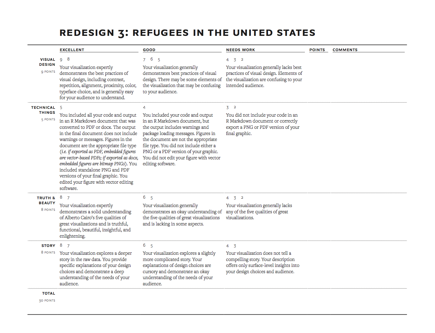
how well you apply the principles of CRAP (this in particular), The Truthful Art, and Effective Data Visualization, and how appropriate the graph is for the data and the story you’re telling. I will use this rubric to grade the final product.
For this assignment, I am less concerned with the code (that’s why I gave most of it to you), and more concerned with the design. Choose good colors based on palettes listed in the reference list. Choose good, clean fonts. Use the heck out of theme(). Add informative design elements in Illustrator/Inkscape. Make it look beautiful and CRAPpy.

The assignment is due by 11:59 PM on Monday, October 16.
You can do this.
Longish note about cleaning the data
The data isn’t perfectly clean and tidy, but it’s real world data, so this is normal. Because the emphasis for this assignment is on design, not code, I’ve provided code to help you clean up the data.
These are the main issues with the data:
- There are non-numeric values in the data, like
-,X, andD. The data isn’t very well documented; I’m assuming-indicates a missing value, but I’m not sure whatXandDmean, so for this assignment, we’ll just assume they’re also missing. - The data generally includes rows for dozens of countries, but there are also rows for some continents, “unknown,” “other,” and a total row. Because Africa is not a country, and neither are the other continents, we want to exclude all non-countries.
- Maintaining consistent country names is the woooooooorst. Countries have different formal official names and datasets are never consistent in how they use those names.For instance, “North Korea”, “Korea, North”, “DPRK”, “Korea, Democratic People’s Republic of”, and “Democratic People’s Repbulic of Korea”, and “Korea (DPRK)” are all perfectly normal versions of the country’s name and you’ll find them all in the wild.
It’s such a tricky problem that social scientists have spent their careers just figuring out how to properly name and code countries. Really.See Gleditsch, Kristian S. & Michael D. Ward. 1999. “Interstate System Membership: A Revised List of the Independent States since 1816.” International Interactions 25: 393-413; or the “ICOW Historical State Names Data Set”.
There are international standards for country codes, though, like ISO 3166-1 alpha 3 (my favorite), or ISO3. It’s not perfect—it omits microstates (some Polynesian countries) and gray area states (Palestine, Kosovo)—but it’s an international standard, so it has that going for it. All this country code stuff is important for mapping data or for joining different datasets.
To ensure that country names are consistent in this data, we use thecountrycodepackage (install it if you don’t have it), which is amazing. Thecountrycode()function will take a country name in a given coding scheme and convert it to a different coding scheme using this syntax: Run?countrycodeto see all the different coding schemes it can convert to/from. Bonus tip: runView(countrycode_data)to see what all those coding schemes look like.
It also does a farily good job at guessing and parsing inconsistent country names (e.g. it will recognize “Congo, Democratic Republic”, even though it should technically be “Democratic Republic of the Congo”). Here, we usecountrycode(variable, "current-coding-scheme", "new-coding-scheme")countrycodeto convert the inconsistent country names into ISO3 codes. We then create a cleaner version of theorigin_countrycolumn by converting the ISO3 codes back into country names. Note that the function chokes on North Korea initially, since it’s included as “Korea, North”—we use thecustom_matchargument to help the function out.- The data isn’t tidy—there are individual columns for each year.
gather()takes every column and changes it to a row. We exclude the country, region, continent, and ISO3 code from the change-into-rows transformation with-origin_country, -iso3, -origin_region, -origin_continent. Currently, the year is being treated as a number, but it’s helpful to also treat it as an actual date. We create a new variable named
year_datethat converts the raw number (e.g. 2009) into a date. The date needs to have at least a month, day, and year, so we actually convert it to January 1, 2009 withymd(paste0(year, "-01-01")).
library(tidyverse)
library(countrycode)
library(lubridate)

non_countries <- c("Africa", "Asia", "Europe", "North America", "Oceania",
                   "South America", "Unknown", "Other", "Total")

refugees_raw <- read_csv("data/refugee_status.csv", na = c("-", "X", "D"))

refugees_clean <- refugees_raw %>%
  rename(origin_country = `Continent/Country of Nationality`) %>%
  filter(!(origin_country %in% non_countries)) %>%
  mutate(iso3 = countrycode(origin_country, "country.name", "iso3c",
                            custom_match = c("Korea, North" = "PRK"))) %>%
  mutate(origin_country = countrycode(iso3, "iso3c", "country.name"),
         origin_region = countrycode(iso3, "iso3c", "region"),
         origin_continent = countrycode(iso3, "iso3c", "continent")) %>%
  gather(year, number, -origin_country, -iso3, -origin_region, -origin_continent) %>%
  mutate(year = as.numeric(year),
         year_date = ymd(paste0(year, "-01-01")))
Data to possibly use in your plot
Here are some possible summaries of the data you might use…
Country totals over time
This is just the refugees_clean data frame I gave you. You’ll want to filter it and select specific countries, though—you won’t really be able to plot 60 countries all at once.
| origin_country | iso3 | origin_region | origin_continent | year | number | year_date |
|---|---|---|---|---|---|---|
| Afghanistan | AFG | Southern Asia | Asia | 2006 | 651 | 2006-01-01 |
| Angola | AGO | Middle Africa | Africa | 2006 | 13 | 2006-01-01 |
| Armenia | ARM | Western Asia | Asia | 2006 | 87 | 2006-01-01 |
| Azerbaijan | AZE | Western Asia | Asia | 2006 | 77 | 2006-01-01 |
| Belarus | BLR | Eastern Europe | Europe | 2006 | 350 | 2006-01-01 |
| Bhutan | BTN | Southern Asia | Asia | 2006 | 3 | 2006-01-01 |
Cumulative country totals over time
Note the cumsum() function—it calculate the cumulative sum of a column.
refugees_countries_cumulative <- refugees_clean %>%
  arrange(year_date) %>%
  group_by(origin_country) %>%
mutate(cumulative_total = cumsum(number))| origin_country | iso3 | origin_region | origin_continent | year | number | year_date | cumulative_total |
|---|---|---|---|---|---|---|---|
| Afghanistan | AFG | Southern Asia | Asia | 2006 | 651 | 2006-01-01 | 651 |
| Afghanistan | AFG | Southern Asia | Asia | 2007 | 441 | 2007-01-01 | 1092 |
| Afghanistan | AFG | Southern Asia | Asia | 2008 | 576 | 2008-01-01 | 1668 |
| Afghanistan | AFG | Southern Asia | Asia | 2009 | 349 | 2009-01-01 | 2017 |
| Afghanistan | AFG | Southern Asia | Asia | 2010 | 515 | 2010-01-01 | 2532 |
| Afghanistan | AFG | Southern Asia | Asia | 2011 | 428 | 2011-01-01 | 2960 |
Continent totals over time
Note the na.rm = TRUE argument in sum(). This makes R ignore any missing data when calculating the total. Without it, if R finds a missing value in the column, it will mark the final sum as NA too, which we don’t want.
refugees_continents <- refugees_clean %>%
  group_by(origin_continent, year_date) %>%
summarize(total = sum(number, na.rm = TRUE))| origin_continent | year_date | total |
|---|---|---|
| Africa | 2006-01-01 | 18116 |
| Africa | 2007-01-01 | 17473 |
| Africa | 2008-01-01 | 8931 |
| Africa | 2009-01-01 | 9664 |
| Africa | 2010-01-01 | 13303 |
| Africa | 2011-01-01 | 7677 |
Cumulative continent totals over time
Note that there are two group_by() functions here. First we get the total number of refugees per continent per year, then we group by continent only to get the cumulative sum of refugees across continents.
refugees_continents_cumulative <- refugees_clean %>%
  group_by(origin_continent, year_date) %>%
  summarize(total = sum(number, na.rm = TRUE)) %>%
  arrange(year_date) %>%
  group_by(origin_continent) %>%
mutate(cumulative_total = cumsum(total))| origin_continent | year_date | total | cumulative_total |
|---|---|---|---|
| Africa | 2006-01-01 | 18116 | 18116 |
| Africa | 2007-01-01 | 17473 | 35589 |
| Africa | 2008-01-01 | 8931 | 44520 |
| Africa | 2009-01-01 | 9664 | 54184 |
| Africa | 2010-01-01 | 13303 | 67487 |
| Africa | 2011-01-01 | 7677 | 75164 |