Single numbers and parts of a whole
Readings due before class on Tuesday, September 12, 2017
Required
- Chapter 6 in Alberto Cairo, The Truthful ArtAlberto Cairo, The Truthful Art: Data, Charts, and Maps for Communication (Berkeley, California: New Riders, 2016).
- Chapters 2 and 6 in Stephanie Evergreen, Effective Data VisualizationStephanie D. H. Evergreen, Effective Data Visualization: The Right Chart for the Right Data (Thousand Oaks, CA: Sage, 2017).
- Engaging Readers with Square Pie/Waffle Charts
- Understanding Pie Charts
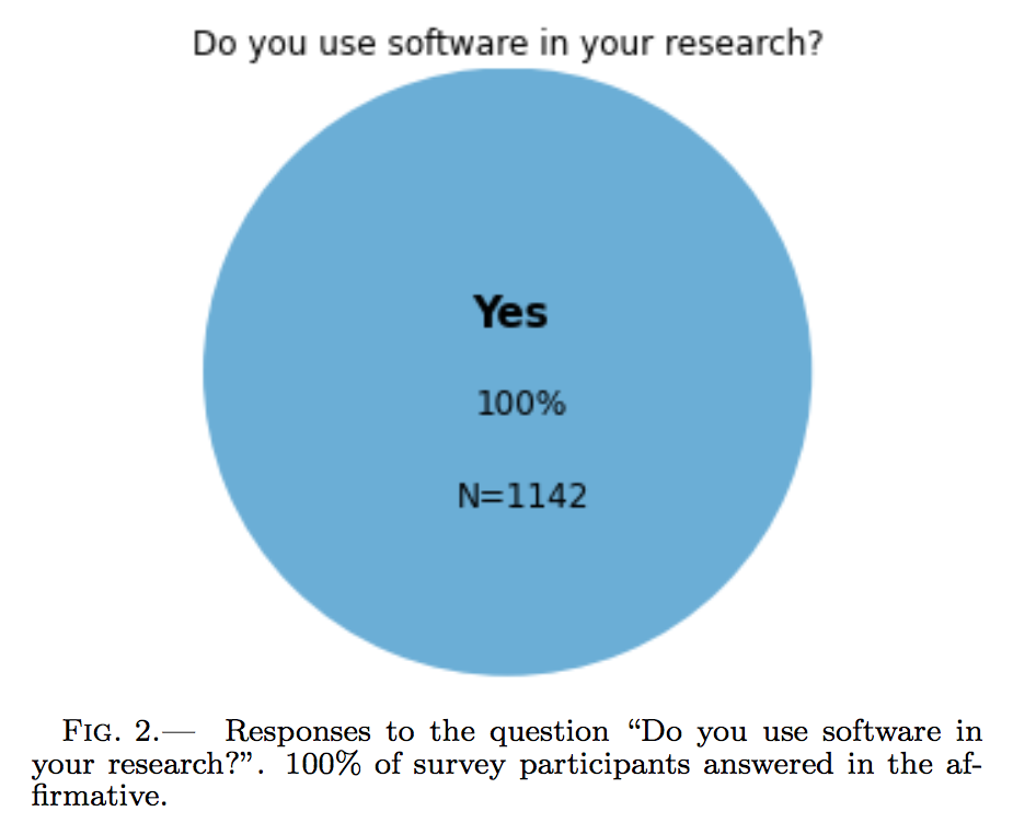
 Figure 2 from Ivelina Momcheva and Erik Tollerud, “Software Use in Astronomy: An Informal Survey,” July 14, 2015, https://arxiv.org/abs/1507.03989.
- Square pie chart beats out the rest in perception study
Recommended
- Ian Spence, “No Humble Pie: The Origins and Usage of a Statistical Chart”Ian Spence, “No Humble Pie: The Origins and Usage of a Statistical Chart,” Journal of Educational and Behavioral Statistics 30, nos. 4, Winter (2005): 353–68, doi:10.3102/10769986030004353.
- Jeffrey Heer and Michael Bostock, “Crowdsourcing Graphical Perception: Using Mechanical Turk to Assess Visualization Design”Jeffrey Heer and Michael Bostock, “Crowdsourcing Graphical Perception: Using Mechanical Turk to Assess Visualization Design,” in ACM Human Factors in Computing Systems, 2010, 203–12, doi:10.1145/1753326.1753357.
Questions to reflect on
- How do these types of visualizations help or hinder or search for truth in data?
- Why are pie charts and curved lines generally unacceptable? When are pie and donut charts acceptable?
- What are different ways to show the variability of a single number? Are some more appropriate than others? Why?