Single numbers and parts of a whole
Materials for class on Tuesday, September 12, 2017
Contents
Slides
Download the slides from today’s lecture
Making a bar chart in Excel
Salt Lake City does a fairly good job of providing open data for public use. The Sunlight Foundation and Code for America have a database of municipal data and rate cities by how accessible and available their data is. Their US City Open Data Census is a fantastic resource.
We’ll create this chart in Excel, based on publicly available data from Salt Lake City.
Things to download:
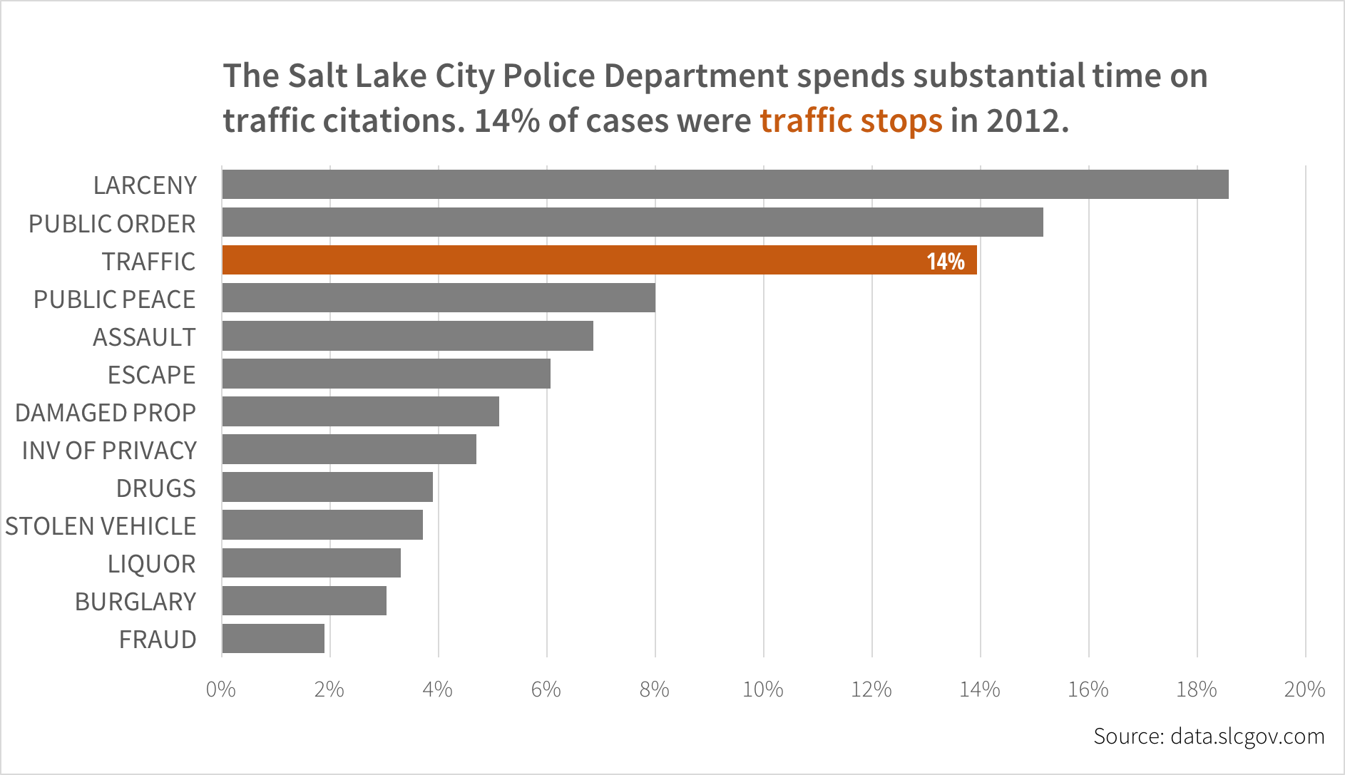
- 2012 Salt Lake City Police Department cases Notice what happens to the Offense Code column when you open this file in Excel. This is a serious problem, particularly in genetics research.
- Source Sans Pro font
Introduction to R
- Creating an RStudio project
- Creating variables
- Working with data frames
- Getting help
- Loading data
- Basic plotting and saving (ggplot2 documentation)
Introduction to Markdown and R Markdown
- What is Markdown? Remember to check out the list of Markdown resources.
- Writing in Markdown (play with Markdown).
- Converting Markdown files to other formats
- Literate programming and R Markdown
Bonus extended example: Creating a production-quality SLCPD chart in R
![]()
Previously, we used R ggplot2 to create analysis-ready graphics. We can create production-ready graphics using the same tools. Here’s an example of a typical workflow:
# Load libraries
library(tidyverse)  # Loads the basic tidyverse packages like dplyr, tidyr, readr, etc.
library(forcats)  # Makes working with factors easier
library(ggstance)  # Create horizontal bar charts
library(scales)  # Add nicer axis labels to plots

# Install fonts
# install.packages("extrafont")
# extrafont::font_import(paths = NULL, recursive = TRUE, prompt = TRUE, pattern = NULL)


# Load data
crimes <- read_csv("data/police-cases-2012.csv") You can also type View(crimes) to look at the data in RStudio.
First, check that the data loaded. You can (and should) also click on the crimes object in the Environment panel in RStudio.
## Observations: 61,295
## Variables: 8
## $ CASE                  <chr> "SL2012221534", "SL201246361", "SL201215...
## $ `OFFENSE CODE`        <chr> "3605-0", "3601-0", "5707-0", "2305-0", ...
## $ `OFFENSE DESCRIPTION` <chr> "SEXUAL OFFENSE", "SEXUAL OFFENSE", "INV...
## $ `REPORT DATE`         <chr> "12/31/2012 03:37:00 PM", "02/06/2012 10...
## $ `OCC DATE`            <chr> "01/01/2012 12:00:00 AM", "01/01/2012 12...
## $ `DAY OF WEEK`         <int> 1, 1, 1, 1, 1, 1, 1, 1, 1, 1, 1, 1, 1, 1...
## $ LOCATION              <chr> "1500 W 800 S", "200 N 200 W", "1300 S S...
## $ COUNCIL               <chr> NA, NA, NA, NA, NA, NA, NA, NA, NA, NA, ...
In Excel, we used a PivotTable to summarize the data by adding how many crimes of each type happened throughout the year. We can do the same with R, using the dplyr package (which is loaded automatically when you run library(tidyverse)). Note that OFFENSE DESCRIPTION is between backticks. Ordinarily, you don’t need to do this when using variable names, but in this case, there’s a space in the name and that breaks everything. The `s are R’s way of quoting variable names.
Also in Excel, we only graphed the observations where the count was greater than 1,000. We can filter the data the same way here with filter(). View the crimes_types object when you’re done.
crimes_types <- crimes %>%
  group_by(`OFFENSE DESCRIPTION`) %>%
  summarize(number = n()) %>%
  mutate(percent = number / sum(number)) %>%
  filter(number > 1000)

crimes_types
## # A tibble: 13 x 3
## `OFFENSE DESCRIPTION` number percent
## <chr> <int> <dbl>
## 1 ASSAULT 4203 0.0686
## 2 BURGLARY 1868 0.0305
## 3 DAMAGED PROP 3141 0.0512
## 4 DRUGS 2392 0.0390
## 5 ESCAPE 3717 0.0606
## 6 FRAUD 1164 0.0190
## 7 INV OF PRIVACY 2880 0.0470
## 8 LARCENY 11394 0.186
## 9 LIQUOR 2023 0.0330
## 10 PUBLIC ORDER 9294 0.152
## 11 PUBLIC PEACE 4906 0.0800
## 12 STOLEN VEHICLE 2273 0.0371
## 13 TRAFFIC 8541 0.139This data is sorted alphabetically by default, since we grouped the data by OFFENSE DESCRIPTION, but sorting it by the count or percent is easy. Note the final line with fct_inorder—this creates a new column called crime that is a factor, or a categorical variable. If we plot the OFFENSE DESCRIPTION variable, R will order it alphabetically. Transforming it into an ordered factor will make R plot the categories in the correct order.
crimes_types_sorted <- crimes_types %>%
  arrange(desc(number)) %>%
  mutate(crime = fct_inorder(`OFFENSE DESCRIPTION`, ordered = TRUE))

crimes_types_sorted
## # A tibble: 13 x 4
## `OFFENSE DESCRIPTION` number percent crime
## <chr> <int> <dbl> <ord>
## 1 LARCENY 11394 0.186 LARCENY
## 2 PUBLIC ORDER 9294 0.152 PUBLIC ORDER
## 3 TRAFFIC 8541 0.139 TRAFFIC
## 4 PUBLIC PEACE 4906 0.0800 PUBLIC PEACE
## 5 ASSAULT 4203 0.0686 ASSAULT
## 6 ESCAPE 3717 0.0606 ESCAPE
## 7 DAMAGED PROP 3141 0.0512 DAMAGED PROP
## 8 INV OF PRIVACY 2880 0.0470 INV OF PRIVACY
## 9 DRUGS 2392 0.0390 DRUGS
## 10 STOLEN VEHICLE 2273 0.0371 STOLEN VEHICLE
## 11 LIQUOR 2023 0.0330 LIQUOR
## 12 BURGLARY 1868 0.0305 BURGLARY
## 13 FRAUD 1164 0.0190 FRAUD## [1] LARCENY PUBLIC ORDER TRAFFIC PUBLIC PEACE
## [5] ASSAULT ESCAPE DAMAGED PROP INV OF PRIVACY
## [9] DRUGS STOLEN VEHICLE LIQUOR BURGLARY
## [13] FRAUD
## 13 Levels: LARCENY < PUBLIC ORDER < TRAFFIC < PUBLIC PEACE < ... < FRAUDWith the data summarized and sorted, we can finally plot it. We’ll go over each of the pieces of this in class, so don’t worry if it looks intimidating—this is the final product. The basic gist of what’s happening is that we take a ggplot() object, map data to aesthetics (in this case x and y mapped to the percent variable and the crime variable), and then add a sequence of layers that determine how that data is plotted.
ggplot(crimes_types_sorted, aes(x = percent, y = fct_rev(crime))) +
  geom_barh(stat = "identity") +
  labs(x = NULL, y = NULL,
       title = "Most frequent crimes in Salt Lake City",
       subtitle = "January 1-December 31, 2012",
       caption = "Source: data.slcgov.com") +
  scale_x_continuous(expand = c(0, 0), labels = percent) +
  theme_light(base_family = "Source Sans Pro") +
  theme(axis.ticks = element_blank(),
        axis.text.x = element_text(family = "Source Sans Pro Light"),
        plot.caption = element_text(family = "Source Sans Pro Light"),
        plot.title = element_text(family = "Source Sans Pro Semibold", size = rel(1.5)),
        panel.border = element_blank(),
        panel.grid.major.y = element_blank())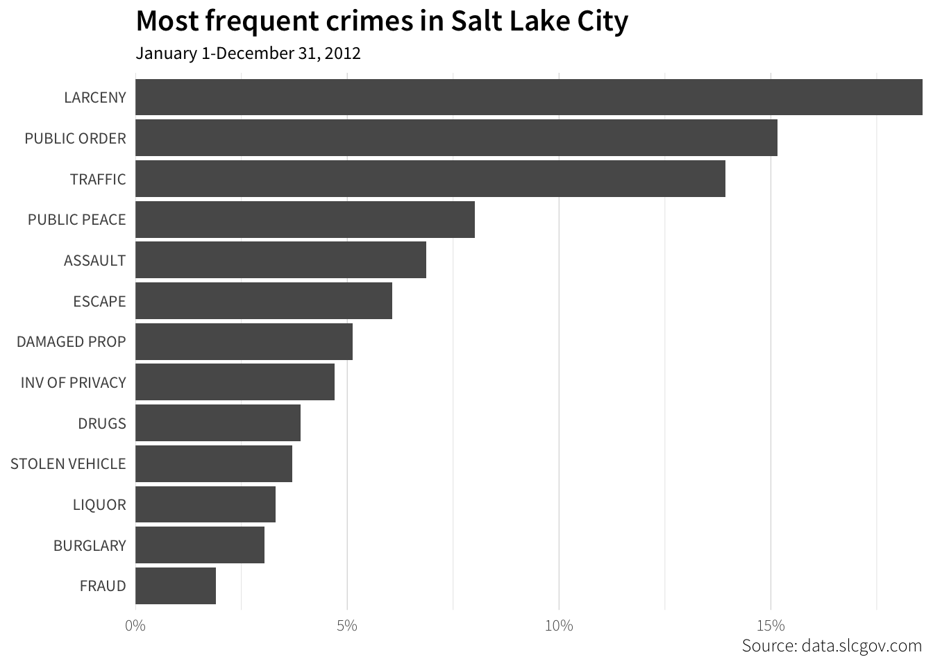
Highlighting the traffic bar is a little tricky, since we can’t select it with the mouse and change the color by hand. The easiest way to do it is to create a new variable to map onto the fill color of each bar. We then remove the legend and modify the colors with guides() and scale_fill_manual():
crimes_highlight <- crimes_types_sorted %>%
  mutate(highlight = ifelse(crime == "TRAFFIC", TRUE, FALSE))

ggplot(crimes_highlight, aes(x = percent, y = fct_rev(crime), fill = highlight)) +
  geom_barh(stat = "identity") +
  labs(x = NULL, y = NULL,
       title = "Most frequent crimes in Salt Lake City",
       subtitle = "January 1-December 31, 2012",
       caption = "Source: data.slcgov.com") +
  scale_x_continuous(expand = c(0, 0), labels = percent) +
  scale_fill_manual(values = c("grey70", "darkorange")) +
  guides(fill = FALSE) +
  theme_light(base_family = "Source Sans Pro") +
  theme(axis.ticks = element_blank(),
        axis.text.x = element_text(family = "Source Sans Pro Light"),
        plot.caption = element_text(family = "Source Sans Pro Light"),
        plot.title = element_text(family = "Source Sans Pro Semibold", size = rel(1.5)),
        panel.border = element_blank(),
        panel.grid.major.y = element_blank())
Finally, adding the label is a little tricky too, since we can’t manually type into the plot. Here, we add yet another variable to the data frame, this time for the text that will show up in the label. We only want to label the bars where highlight == TRUE, so we use an ifelse() statement to do that. We also save the plot to a variable instead of just plotting directly (i.e. instead of running ggplot(), we assign it to plot_crimes)
crimes_highlight_label <- crimes_highlight %>%
  mutate(text = ifelse(highlight, paste0(round(percent * 100), "%"), ""))

plot_crimes <- ggplot(crimes_highlight_label, aes(x = percent, y = fct_rev(crime),
                                                  fill = highlight, label = text)) +
  geom_barh(stat = "identity") +
  geom_text(hjust = 1.3, family = "Source Sans Pro", color = "white") +
  labs(x = NULL, y = NULL,
       title = "Most frequent crimes in Salt Lake City",
       subtitle = "January 1-December 31, 2012",
       caption = "Source: data.slcgov.com") +
  scale_x_continuous(expand = c(0, 0), labels = percent) +
  scale_fill_manual(values = c("grey70", "darkorange")) +
  guides(fill = FALSE) +
  theme_light(base_family = "Source Sans Pro") +
  theme(axis.ticks = element_blank(),
        axis.text.x = element_text(family = "Source Sans Pro Light"),
        plot.caption = element_text(family = "Source Sans Pro Light"),
        plot.title = element_text(family = "Source Sans Pro Semibold", size = rel(1.5)),
        panel.border = element_blank(),
        panel.grid.major.y = element_blank())

plot_crimes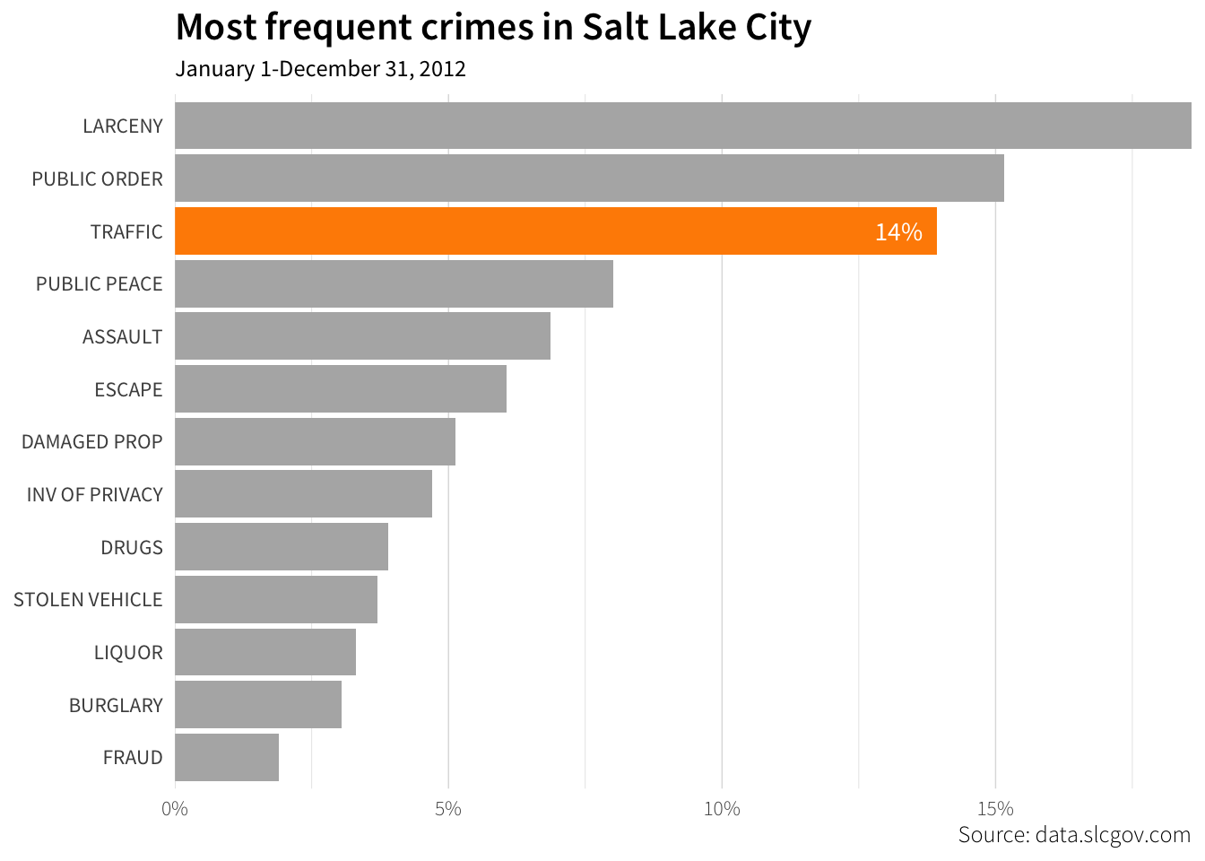
Finally, we can save this plot as a file using the ggsave() function. The plot should save just fine as a PNG file. Saving as a PDF is slightly trickier, though, since PDFs have embedded fonts. R’s default PDF writer can only embed a handful of PDF fonts, but R has a second PDF writer based on the Cairo graphics library that can embed fonts just fine. idk why ¯\_(ツ)_/¯
R is just weird sometimes. You definitely don’t need to understand the details of how Cairo works—I don’t. All that matters is that when you use the Cairo PDF library, fonts are embedded properly and everything works.
You just have to specify the plotting device in ggsave() with device = cairo_pdf.
ggsave(filename = "plot_crimes.png", plot = plot_crimes,
       width = 6, height = 3.5, units = "in")

ggsave(filename = "plot_crimes.pdf", plot = plot_crimes,
       width = 6, height = 3.5, units = "in", device = cairo_pdf)
Using the Cairo library for PNGs can also be helpful. R sometimes generates wonky PNGs in Windows, and Cairo PNGs work better in PowerPoint and Word. Saving Cairo-based PNGs with ggsave() has a slightly different syntax (use type = "cairo" instead of device = cairo_pdf):
ggsave(filename = "plot_crimes_cairo.png", plot = plot_crimes,
       width = 6, height = 3.5, units = "in", type = "cairo")
Feedback for today
Go to this form and answer these three questions (anonymously if you want):
- What new thing did you learn today?
- What was the most unclear thing about today?
- What was the most exciting thing you learned today?