Comparisons
Due by 11:59 PM on Monday, October 2, 2017
As always, complete these tasks in an R Markdown file and e-mail me a Word file or a PDF of the final compiled document. Here’s a starter file.Your browser will most likely open it as a new tab instead of downloading the file. Either right click on the link and choose “Save link as…” or copy and paste the text into a blank R Markdown file in RStudio.
I recommend saving it within an RStudio project.
Task 1: Reflection memo
Write a 250-wordSpecial for this week only! Have a happy General Conference.
memo about the assigned readings for this week. You can use some of the prompt questions there if you want:
- In chapter 3, Evergreen provides a ton of new ways to present comparisons. Which ones are your favorite? Which ones didn’t quite click with you? In what situations are some more appropriate than others?
- Do combo charts and bullet graphs break the rule against double y-axes? Why or why not?
As you write the memo, also consider these central questions:
- How do these readings connect to our main goal of discovering truth?
- How does what I just read apply to me?
- How can this be useful to me?
Task 2: Create a slopegraph in Excel
Back to Excel for a minute! Download this data on the number of rat sightings in New York City’s five boroughs in 2010 and 2016 and create a slopegraph following Stephanie Evergreen’s tutorial on pages 36–44 in Effective Data Visualization. Include the finished graphic in the memo.
Important tip: You can include images in Markdown with the follwing syntax: . If you’re exporting the memo as a PDF, include a PDF version of the slopegraph; f you’re exporting the memo as HTML or docx, include a PNG version of the slopegraph.
(So, if you put the image in a folder named images/ in your project directory, you’d do something like this): 
Task 3: Working with tidy data
Download all these files and place them in your data/ folder. You’ll probably need to right click on each and choose “Save link as…”.
You’ll answer a bunch of questions about this data, and you’ll find those questions in this week’s homework template.
ggplot works best when your data is tidy. This doesn’t just mean that the data is clean and free of errors—it refers to data that meets three specific criteria:
- Each variable must have its own column.
- Each observation must have its own row.
- Each value must have its own cell.
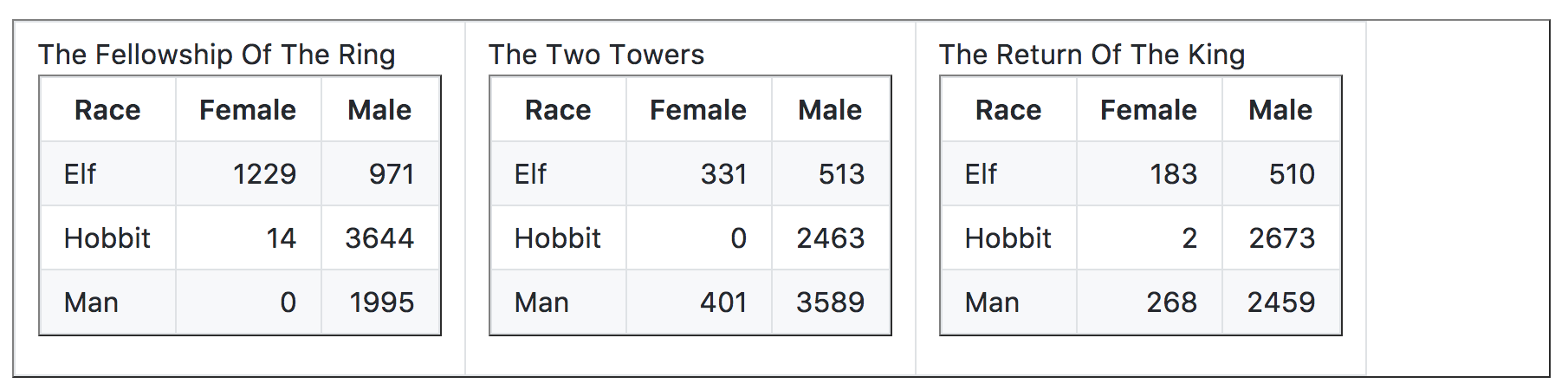
Data you come across in the real world is often not tidy—not because it’s wrong, but because it’s structured in a way that makes it easier for humans to read. For instance, look at this table of words spoken in Peter Jackson’s Lord of the Rings trilogy:Data from Jenny Bryan’s lesson on tidy data.
Tidy data makes these kinds of calculations far easier. Here’s that same data in tidy format:
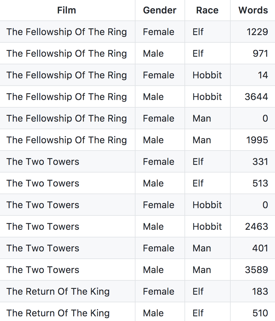
This is longer and more repetitive (and perhaps ugly), but far, far easier for computers to work with. Each varaible has its own column now (Film, Gender, Race, and Words), each observation has its own row, and each value is in its own cell.
Untidy data comes in lots of different forms, but the R package tidyr (which is part of the tidyverse and is loaded when you run library(tidyverse)), can tidyify pretty much anything. You can see full details in this vignette for tidyr.