Single numbers and parts of a whole
Due by 11:59 PM on Monday, September 11, 2017
Task 1: Reflection memo
Write a 500-word memo about the assigned readings for this week. You can use some of the prompt questions there if you want. As you write the memo, also consider these central questions:
- How do these readings connect to our main goal of discovering truth?
- How does what I just read apply to me?
- How can this be useful to me?
E-mail me a PDF of the memo.
Task 2: Playing with R
This example uses data from the Gapminder project.
You may have seen Hans Rosling’s delightful TED talk showing how global health and wealth have been increasing. If you haven’t, you should watch it. Sadly, Hans died in February 2017.
You’ll need to install the gapminder R package first. Install it either with the “Packages” panel in RStudio or by typing install.packages("gapminder") in the R console.
For this first R-based assignment, you won’t do any actual coding. Download this file,
Your browser might show the file instead of downloading it. If that’s the case, you can copy/paste the code from the browser to RStudio. In RStudio, go to “File” > “New” > “New R Markdown…”, click “OK” with the default options, delete all the placeholder code/text in the new file, and paste the example code in the now-blank file.
open it in RStudio, and walk through the examples in RStudio on your computer. If you place your cursor on some R code and press “⌘ + enter” (for macOS users) or “ctrl + enter” (for Windows users), RStudio will send that line to the console and run it.
There are a few questions that you’ll need to answer, but that’s all.
Life expectancy in 2007
Let’s first look at the first few rows of data:
## # A tibble: 6 x 6
##   country     continent  year lifeExp      pop gdpPercap
##   <fct>       <fct>     <int>   <dbl>    <int>     <dbl>
## 1 Afghanistan Asia       1952    28.8  8425333      779.
## 2 Afghanistan Asia       1957    30.3  9240934      821.
## 3 Afghanistan Asia       1962    32.0 10267083      853.
## 4 Afghanistan Asia       1967    34.0 11537966      836.
## 5 Afghanistan Asia       1972    36.1 13079460      740.
## 6 Afghanistan Asia       1977    38.4 14880372      786.
Right now, the gapminder data frame contains rows for all years for all countries. We want to only look at 2007, so we create a new data frame that filters only rows for 2007.
Note how there’s a weird sequence of characters: %>%. This is called a pipe and lets you chain functions together. We could have also written this as gapminder_2007 <- filter(gapminder, year == 2007).
## # A tibble: 6 x 6
##   country     continent  year lifeExp      pop gdpPercap
##   <fct>       <fct>     <int>   <dbl>    <int>     <dbl>
## 1 Afghanistan Asia       2007    43.8 31889923      975.
## 2 Albania     Europe     2007    76.4  3600523     5937.
## 3 Algeria     Africa     2007    72.3 33333216     6223.
## 4 Angola      Africa     2007    42.7 12420476     4797.
## 5 Argentina   Americas   2007    75.3 40301927    12779.
## 6 Australia   Oceania    2007    81.2 20434176    34435.
Now we can plot a histogram of 2007 life expectancies with the default settings:
## `stat_bin()` using `bins = 30`. Pick better value with `binwidth`.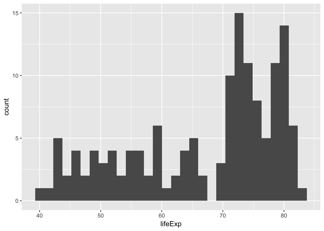
R will use 30 histogram bins by default, but that’s not always appropriate, and it will yell at you for doing so. Adjust the number of bins to 2, then 40, then 100. What’s a good number for this data? Why?
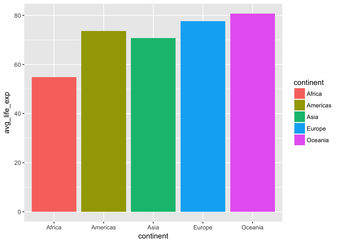
Average life expectancy in 2007 by continent
We’re also interested in the differences of life expectancy across continents. First, we can group all rows by continent and calculate the mean:
This is where the %>% function is actually super useful. Remember that it lets you chain functions together—this means we can read these commands as a set of instructions: take the gapminder data frame, filter it, group it by continent, and summarize each group by calculating the mean. Without using the %>%, we could write this same chain like this: summarize(group_by(filter(gapminder, year == 2007), continent), avg_life_exp = mean(lifeExp)). But that’s awful and impossible to read and full of parentheses that can easily be mismatched.
gapminder_cont_2007 <- gapminder %>%
  filter(year == 2007) %>%
  group_by(continent) %>%
  summarize(avg_life_exp = mean(lifeExp))

head(gapminder_cont_2007)
## # A tibble: 5 x 2
## continent avg_life_exp
## <fct> <dbl>
## 1 Africa 54.8
## 2 Americas 73.6
## 3 Asia 70.7
## 4 Europe 77.6
## 5 Oceania 80.7Let’s plot these averages as a bar chart:
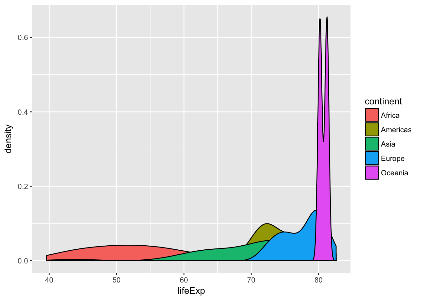
Then, let’s plot them as density distributions. We don’t need to use the summarized data frame for this, just the original filtered gapminder_2007 data frame:
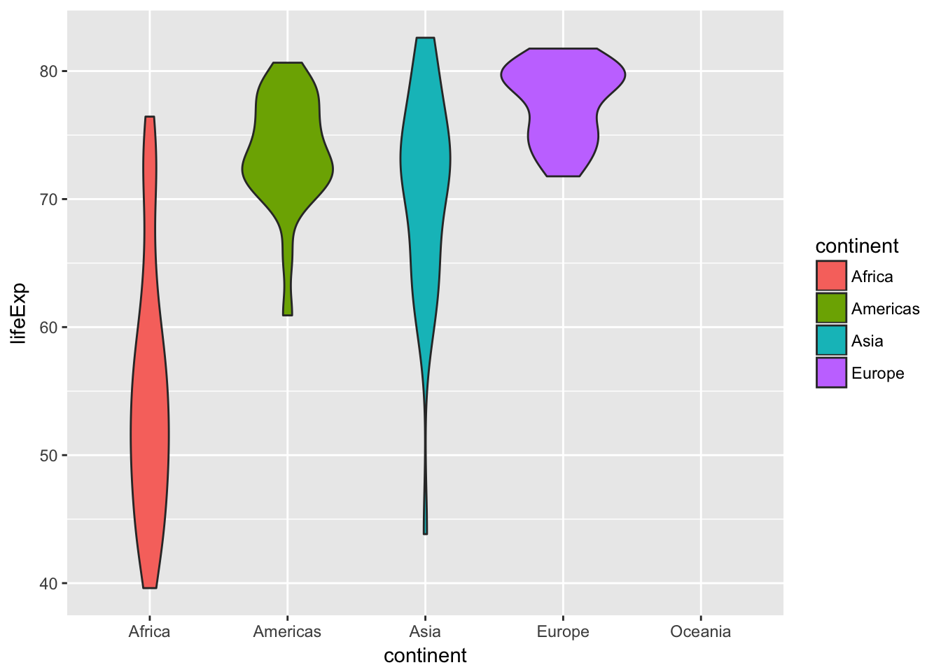
Now let’s plot life expectancies as violin charts. These are the density distributions turned sideways:
Finally, we can add actual points of data for each country to the violin chart:
ggplot(gapminder_2007, aes(x = continent, y = lifeExp, fill = continent)) +
geom_violin() +
geom_point()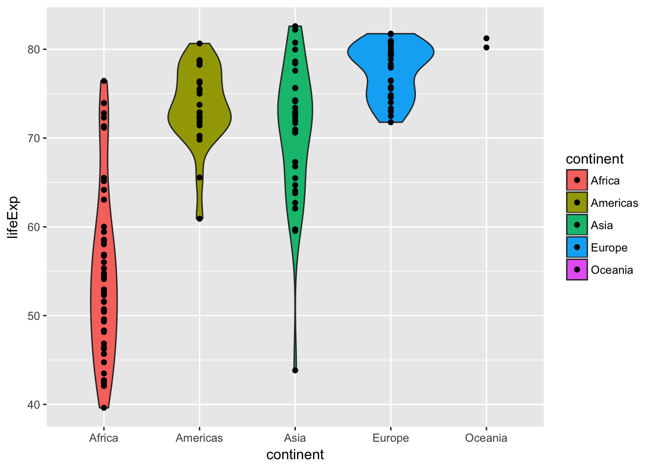
The bar chart, density plot, violin plot, and violin plot + points each show different ways of looking at a single number—the average life expectancy in each continent. Answer these questions:
- Which plot is most helpful?
- Which ones show variability?
- What’s going on with Oceania?
E-mail me the answers to the questions posed in this example.