Redesign 1: Comic Relief Grants
Due by 11:59 PM on Monday, September 18, 2017

Comic Relief is an international NGO that funds health and educaiton programs throughout the world. The organization raises money primarily through its annual Red Nose Day, a celebrity-heavy comedy telethon broadcast on the BBC in the UK, on NBC in the US, and on YouTube everywhere else (they also partner with the Gates Foundation). For example, check out the search for Stephen Hawking’s new voice, The Ultimate, Definitive, Multi-Celebrity Plea, and a short history of Red Nose Day.
For this first redesign project, you will use Excel to redesign this graphic showing how many grants Comic Relief awarded to recipients in other countries in 2015 and 2016, divided by grant size:
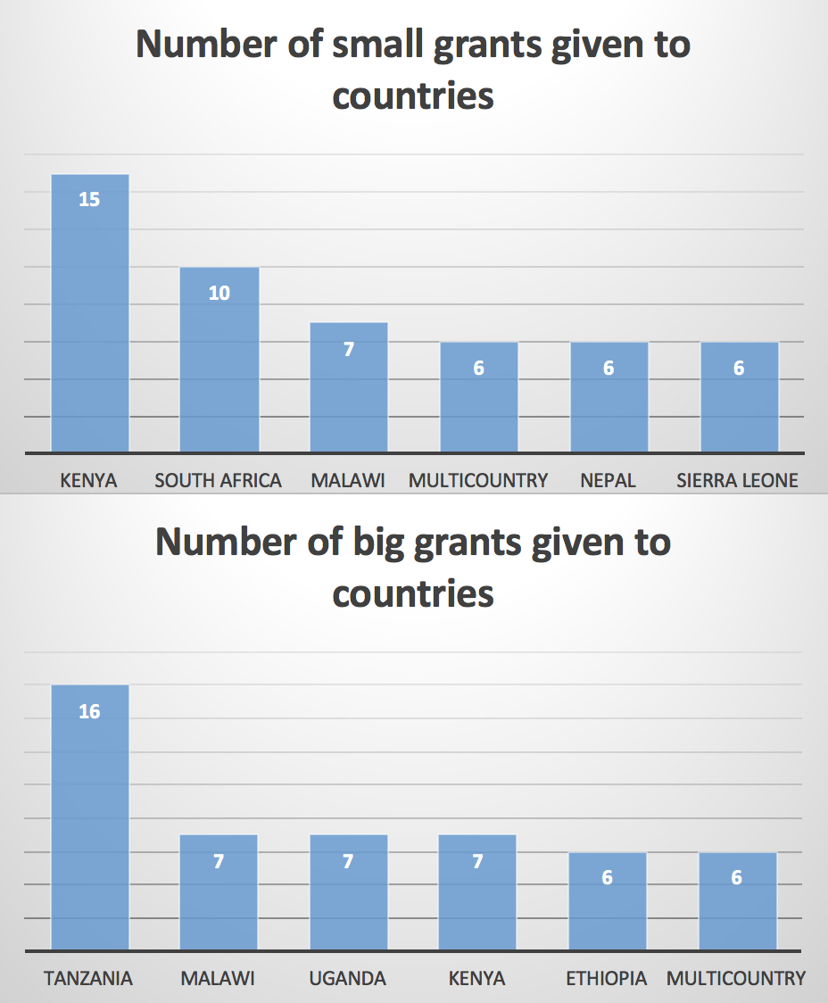
In this redesign, we’re interested in exploring this question: Is there a difference in which countries receive bigger or smaller Comic Relief grants?. The answer will be (spoiler alert) yes, which is a boring answer all by itself. Try to highlight something deeper in the data—are there discrepancies in which countries get big or small grants? Are there other interesting stories hidden in the data?
Here’s what you need to do:
- Comic Relief follows the 360Giving standard for collecting and distributing grant data, which means the data they provide is fairly clean and standard. You can find data from dozens of other UK-based charities in 360Giving’s Data Registry.
Download Comic Relief’s dataset of international grants awarded in 2015–16: Comic Relief 2015–2016 grants - Hint: The columns you’ll need to worry about are
Amount AwardedandBeneficiary Location:0:Name. You might also want to create a new column/variable in the data to indicate if a grant is big or small—look into theIF()Excel function. The median value is £432,833, but you should calculate that in Excel.
Summarize the data in a PivotTable. In this case, a “big” grant means that the grant was larger than the median value of all grants; a “small” grant was smaller than the median. - Create an appropriate visualization based on the data summarized in the PivotTable.
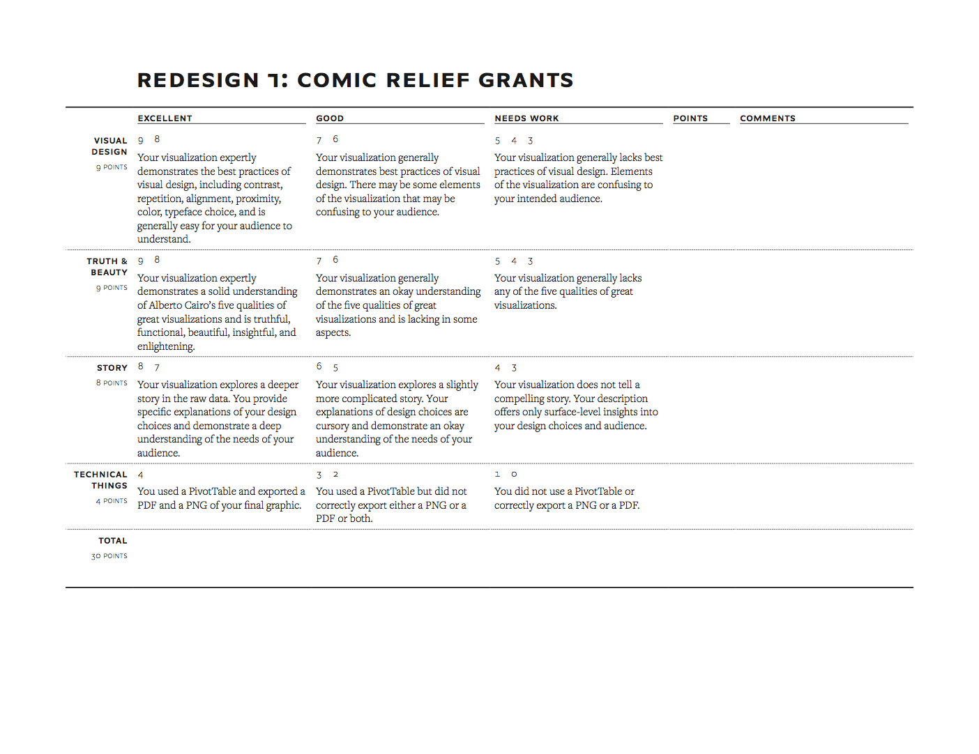
- Write a memo (no word limit) explaining your process. I’m specifically looking for a discussion of the following:
- What was wrong with the original graphic?
- What story are you telling with your new graphic?
- How did you apply the principles of CRAP? Pro tip: Imagine that this new graph could show up in an annual report and try making the new figure fit with the branding and style of Comic Relief.
- How did you apply Alberto Cairo’s five qualities of great visualizations?
- E-mail me the following outputs:
- The Excel file with the PivotTable
- A PDF of your memo
- A standalone PNG version of your graphic
- A standalone PDF version of your graphic
You will be graded based on how you use Excel and PivotTables, It might be tempting to just type the numbers from the original chart into a spreadsheet and make a graph with them. 
how well you apply the principles of CRAP, The Truthful Art, and Effective Data Visualization, and how appropriate the graph is for the data and the story you’re telling. I will use this rubric to grade the finished product. The assignment is due by midnight on Monday, September 18.
Please don’t hestiate to ask for help from your classmates or from me!